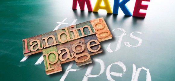
Whether you are a new or old Internet Marketer, one thing you need to understand and take note of is Landing Pages. Do you know what a Landing Page is?
Landing pages are extremely important in this day and age for your sales process. You may have nothing but Landing Pages and that is how you run your business. Some may only use Landing Pages during certain campaigns.
Let’s talk about the background. I’m sure you have seen some pretty awesome backgrounds on other people’s Landing Pages. They have probably tested them to see which draws the biggest audience. Some leave the canvas blank and use a white background. That’s OK too.
So your choices are: graphics, clean white background, stock photo or have someone draw or develop a unique background for you.
The Choice
When I use Clickfunnels to build my Sales and Landing Pages, it couldn’t be any easier than a couple of clicks of the mouse. Consider the platform you are using. Are you trying to make a Landing Page in WordPress?
I know that I had to learn a bit of HTML to manipulate the code to accept some of the custom images I used in the background. I am not a coder, nor do I want to be one. (I know just enough code to be dangerous 😉
Some platforms are extremely hard to manipulate so pick the best foundation before starting to build that Landing Page. It would be tough to get your vision all out in front of you only to find out your platform doesn’t or can’t handle your graphics. See if the platform is multi-functional before you put in all the work only to find out you can’t even use the graphic.
Visitors will respond more to your Landing page if it has a WOW! Factor. Solid backgrounds are solid backgrounds and everyone has seen them a thousand times. Choose to be different.
Take a look at these articles on the HubSpot website: 15 of the Best Landing Page Designs or 11 Great Landing Page Designs.
One of the examples, Basecamp, uses the clean and minimalistic look. Another one, Muck Rack, uses side-by-side images. Think about your own brand identity and try to stick with a background that represents you and your business.
If you want to put together a couple of different examples, do some split testing to help you decide which has the most impact on your audience.
Color
Color can benefit your business because there is actually a Psychology behind color. Using specific colors on your Landing Pages and website can have an impact on the thoughts and emotions of your visitors.
Yes, you read that right! Color can make or break your website. Take a look at this color wheel to help you decide how you would like to design your Landing Pages:
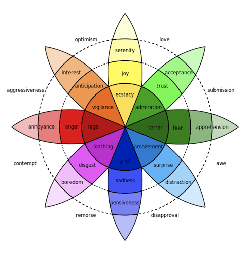
Three colors that get used consistently are black, white and grey. But blue and green get used quite a bit as well and there is a reason behind that.
Green is not only a calming color but it makes people have a feeling of optimism. Using a soothing color for your background can also improve your visitor’s reading speed and comprehension abilities.
Blue, as you are probably aware, is one of the most used colors on the color chart. Blue gives people a sense of a steady and stable environment. Use blue on your marketing materials and Landing Pages to get people to interact and take action. Blue seems to be the color of the internet.
Try split-testing a blue or green background with say an orange or red. I am sure you will see a substantial amount of positive response to the blue/green vs. the red or other colors.
Tools
Unless you are a Photoshop guru (I admit I am NOT) you probably struggle with making great graphics. Photoshop is one more program I just did not want to take the time to learn. I can find people on Fiverr.com who can make amazing graphics.
But, if you want to make some of your own graphics, Canva is an amazing site where you can literally drag and drop to create a stunning graphic. It’s free to the public although there are photos that you can purchase (some are only $1).
One of the things I like about it is the pre-made dimensions that can help you design images for Facebook cover photos, infographics and blog post images.
For a couple of dollars (if you choose to buy their photostock or graphic) you can create any graphic you like. The program also allows you to upload your own images and graphics free of charge. I’ll choose this method any day versus learning Photoshop!
Images
You have probably heard me talk about finding free images on the internet. A few places you can visit are DepositPhotos.com, Shutterstock.com, iStockphoto.com or MorgueFile.com. There are free photos but you can buy some as well (Morguefile truly is all free photos). The thing you need to watch out for are their rules on using the photos.
Some of the providers on those sites will not allow you to use their photos to be used in resell items. Just make sure you are following the rules.
Don’t use images off of Google. Those photos/graphics are most likely owned by someone. You don’t want to infringe on the rights. Get an idea, though, by searching through Google to see if there is something that represents your brand identity. Then, visit one of the above sites to see if you can find something similar.
Layout
Use images to your advantage. You want to focus the reader’s attention so use your images to do just that. Use a soothing background as mentioned earlier but use an effective image for your call-to-action (CTA).
Your CTA image must convey a message otherwise it’s pointless. Use photos that have humans in them because visitors feel it adds a positive aspect to your Landing Page.
That about sums it up! Is there something you use that you would like to contribute to this article? Drop us a comment and we will add it to the article!
To Your Success,

P.S. If you want to make a signature like the one I use here, visit MyLiveSignature. Watch out though because it can become addictive with all the thousands of possibilities! Don’t say I didn’t warn you!
